today in the double I worked on the shop page and I made good progress, i created a B master page which had the layout / design for the three child pages that connect to the store which had on it a purple box on each side of the page which had a gradient effect where it goes from solid purple to transparent, on the store page is the information about the tickets and then you can go onto a review order page from there, billing address page, and then review order page. I copied most of the information from the actual luna park ticket page, because on my store I'm selling luna park tickets because my music video is set in luna park so I guess the video will be kind of promoting luna park and then my website is promoting my film as well as luna park.
To get the design for these pages I looked at the layout on the Luna Park sydney website which inspired the layout and colours for mine.
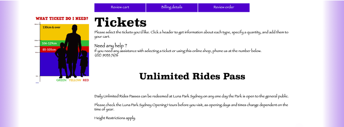
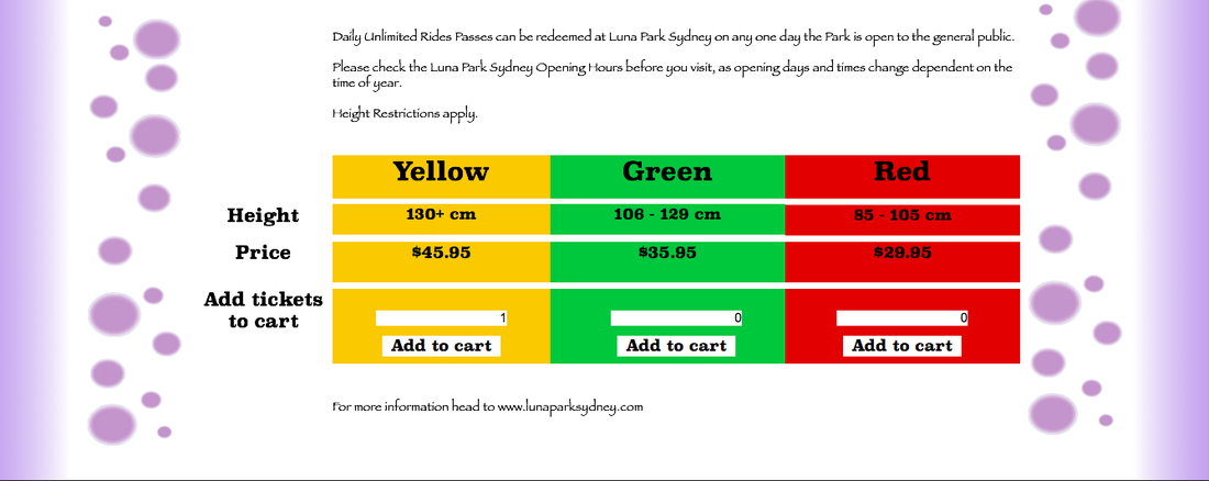
Because the tickets are colour coded and have height differences which also match up to the colours, I kept the colours the same even though they don't match to the rest of my site, because they are LUNA PARK tickets and not MY tickets I thought it would be better to keep to their colour coding system when it comes to their tickets.
I used their real phone numbers from their websites as well as the size guide I copied and then used the correct height requirements, pricings and their three child headings which come with purchasing tickets, these include review cart, billing details and review order.
To get the design for these pages I looked at the layout on the Luna Park sydney website which inspired the layout and colours for mine.
Because the tickets are colour coded and have height differences which also match up to the colours, I kept the colours the same even though they don't match to the rest of my site, because they are LUNA PARK tickets and not MY tickets I thought it would be better to keep to their colour coding system when it comes to their tickets.
I used their real phone numbers from their websites as well as the size guide I copied and then used the correct height requirements, pricings and their three child headings which come with purchasing tickets, these include review cart, billing details and review order.
The trouble I found was figuring out what to do with making a realistic web page for the shop in which you could 'add' an item to 'the cart' which then re-directs you to another page to continue on with your purchase.
As far as I could find there wasnt an option for what I was looking for so I decided to just put a hyperlink on each of the 'Add to cart' boxes which re-directs you to the next child page which is 'review cart'
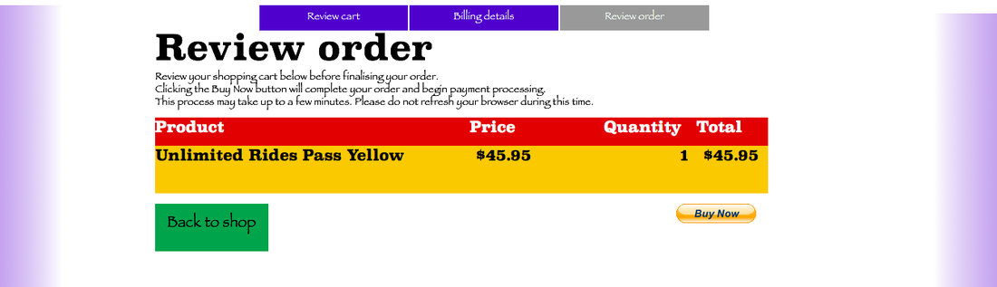
Although this doesn't seem as realistic because if you click on either green or red instead of yellow, the next page as you will see shows you buying the yellow ticket, which is why in the box in the yellow I put a '1' and in the others '0' to try and persuade the viewer to click on the yellow add to cart when viewing this website.
Once again I added an arrangement of bubbles to stick with my theme and add a personal touch.
Copying the layout and way they set out this page on the luna park website, I went on to quickly do the first child page of review cart
As far as I could find there wasnt an option for what I was looking for so I decided to just put a hyperlink on each of the 'Add to cart' boxes which re-directs you to the next child page which is 'review cart'
Although this doesn't seem as realistic because if you click on either green or red instead of yellow, the next page as you will see shows you buying the yellow ticket, which is why in the box in the yellow I put a '1' and in the others '0' to try and persuade the viewer to click on the yellow add to cart when viewing this website.
Once again I added an arrangement of bubbles to stick with my theme and add a personal touch.
Copying the layout and way they set out this page on the luna park website, I went on to quickly do the first child page of review cart
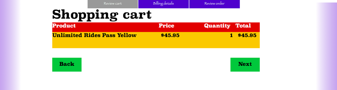
a very basic and simple design, I hyperlinked the 'Next' button to take you to billing details and hyperlinked the 'Back' button to the main shop page.
next was the billing address page
next was the billing address page
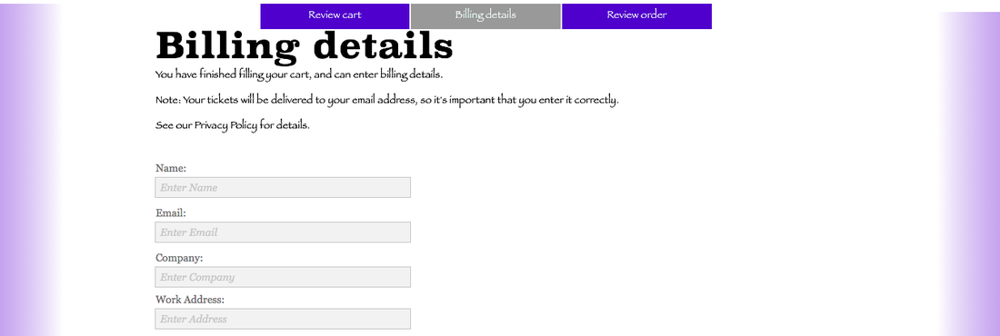
Because this page was for address details I made it very sleek looking and professional without all the yellow red or green themed page, I put in the more complex contact form and then hyperlinked the 'Submit' button to take you to the 'Review order page' and then of course some bubbles on the sides
The Review order page was a bit difficult trying to figure out if there was a way to link the information given in the previous contact form, unfortunately there wasnt because the contact form is meant to send the information strait to an email not to the website or aid another aspect of the website. So instead I just repeated the shopping carts layout and added a PayPal 'Buy now' button which people would be able to click on and then proceed to the credit card detail page. And then also Hyperlinking the 'Back to shop' box to the main shop page.
The Review order page was a bit difficult trying to figure out if there was a way to link the information given in the previous contact form, unfortunately there wasnt because the contact form is meant to send the information strait to an email not to the website or aid another aspect of the website. So instead I just repeated the shopping carts layout and added a PayPal 'Buy now' button which people would be able to click on and then proceed to the credit card detail page. And then also Hyperlinking the 'Back to shop' box to the main shop page.
With that
 RSS Feed
