http://www.muse-themes.com/products/before-after-image-slider
i found this website with the help of sir and iv been trying to download some new widgets to spice up my website
at the same time uploading my movie to youtube because i can't access my movie on youtube through the schools channel because the school has blocked a lot of stuff on their wifi.
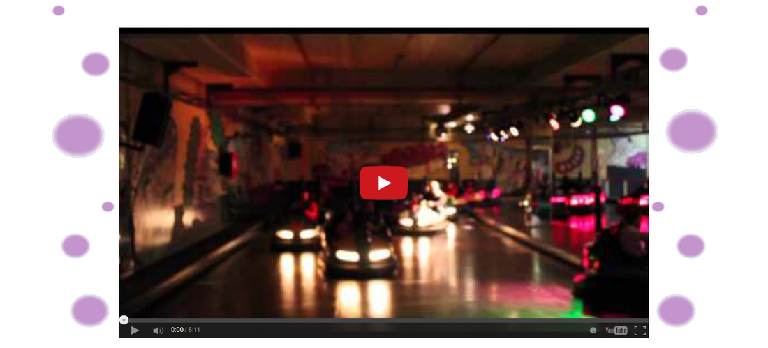
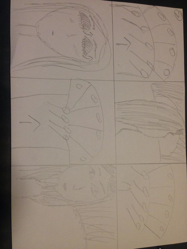
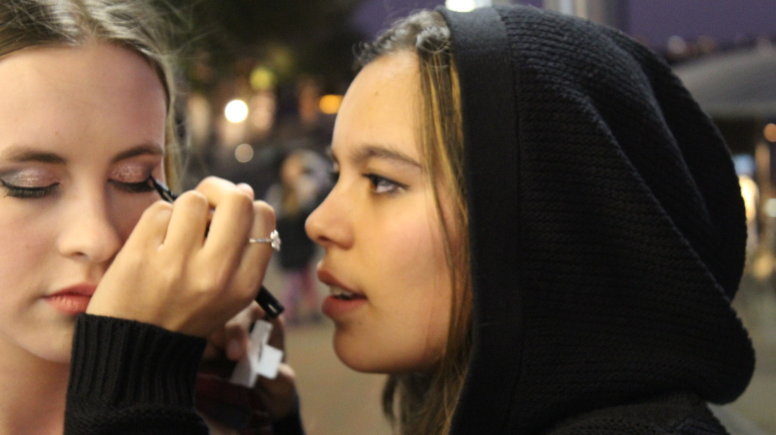
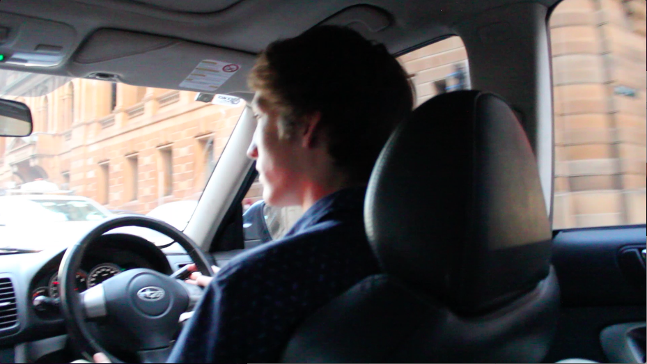
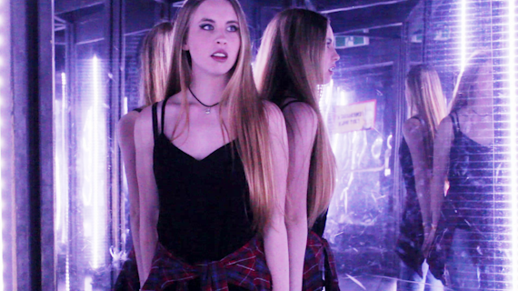
after uploading my movie I decided that I was going to put my movie on my home page to be displayed. I wanted something in-between the slideshow and the movie to break it up and introduce it before jumping strait in. So I decided to go with a black and white image to balance out the explosion of colours which was just presented in the slideshow.
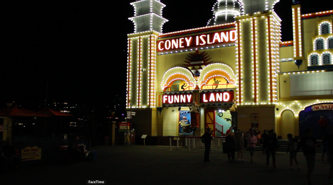
So I found a screenshot I liked and wanted to change it around a bit so it wasnt just an old image so I cropped it and doubled it as shown :
i found this website with the help of sir and iv been trying to download some new widgets to spice up my website
at the same time uploading my movie to youtube because i can't access my movie on youtube through the schools channel because the school has blocked a lot of stuff on their wifi.
after uploading my movie I decided that I was going to put my movie on my home page to be displayed. I wanted something in-between the slideshow and the movie to break it up and introduce it before jumping strait in. So I decided to go with a black and white image to balance out the explosion of colours which was just presented in the slideshow.
So I found a screenshot I liked and wanted to change it around a bit so it wasnt just an old image so I cropped it and doubled it as shown :
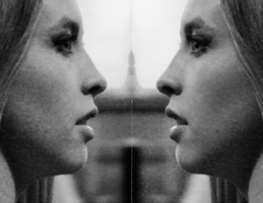
through photoshop this was possible.
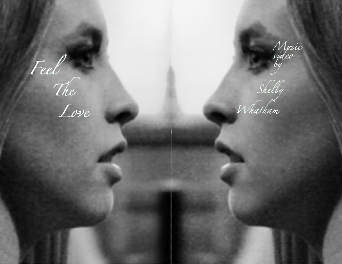
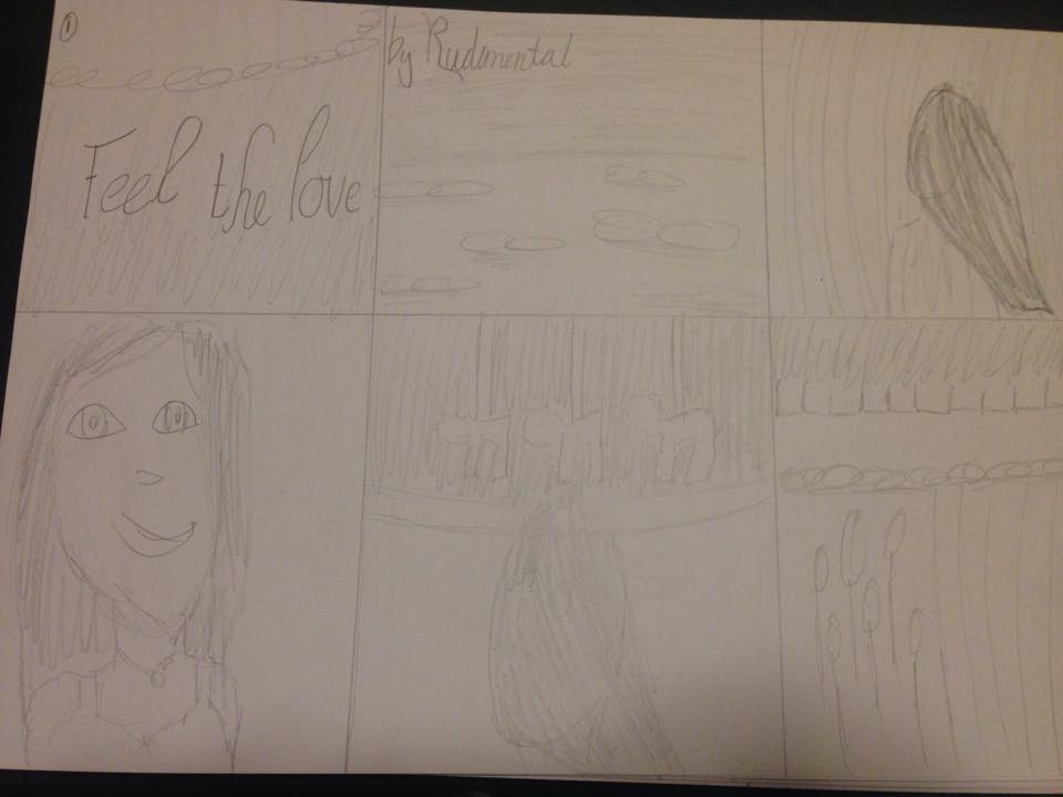
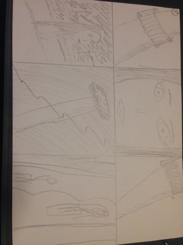
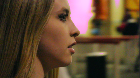
Following the idea of introducing the film before actually seeing it, I decided to put a small dainty couple of lines of text for a dramatic impact, even though the text is small it still is clearly visible and is quite an artistic flair saying " Feel the love - Music video by shelby whatham" :
Following the idea of introducing the film before actually seeing it, I decided to put a small dainty couple of lines of text for a dramatic impact, even though the text is small it still is clearly visible and is quite an artistic flair saying " Feel the love - Music video by shelby whatham" :
then placing the video underneath through Widgets library - Social - youtube and then typing in the videos ID, it came up and then I decided that would be all I would put on my home page, however the three main items on the page ( slideshow, photo and video ) looked plain and that I needed to spice up the look.
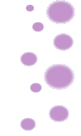
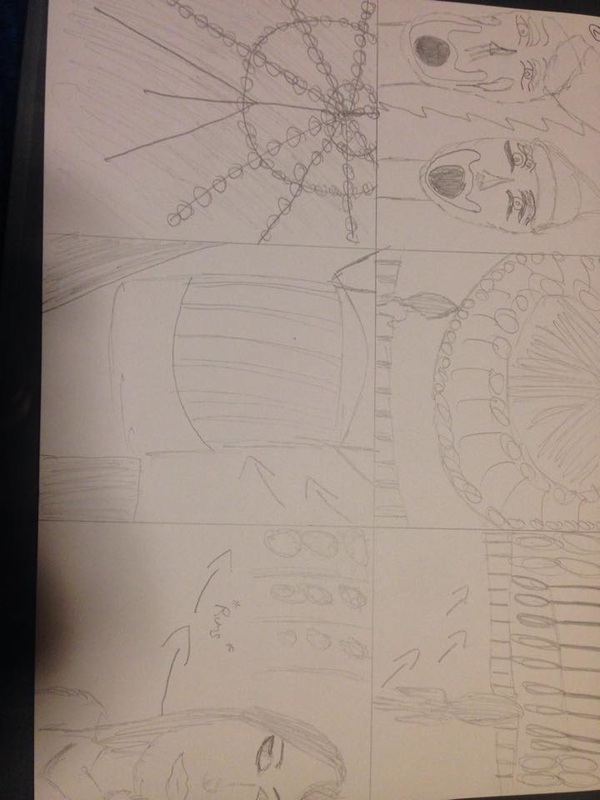
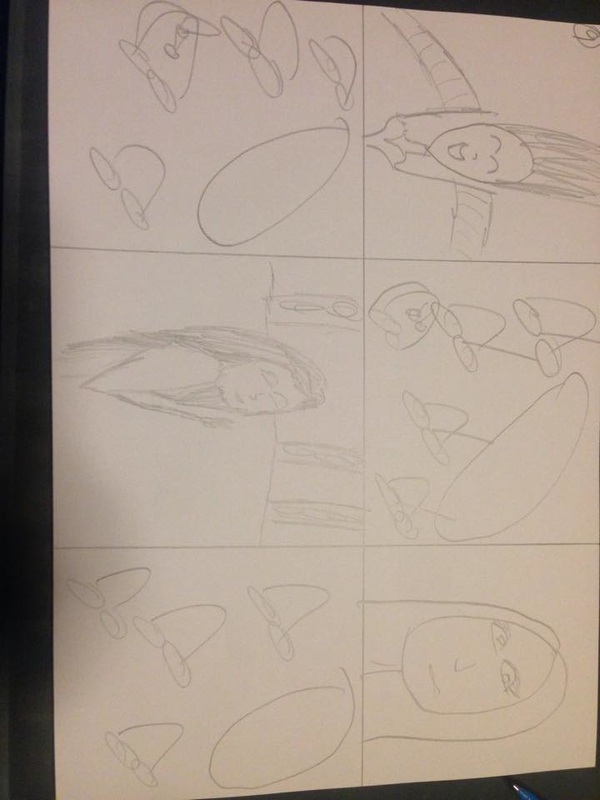
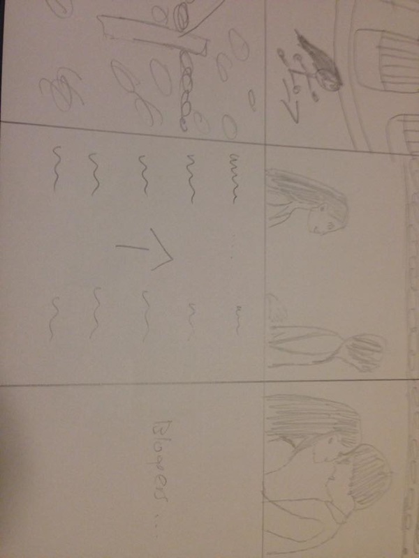
So I went to my film folio and copied a purple bubble image icon that I had created before and copied and pasted and just played around with different sizes and arrangements so that there would be a collection of purple bubbles on the side of the black and white images, and I ended up liking this arrangement :
So I went to my film folio and copied a purple bubble image icon that I had created before and copied and pasted and just played around with different sizes and arrangements so that there would be a collection of purple bubbles on the side of the black and white images, and I ended up liking this arrangement :
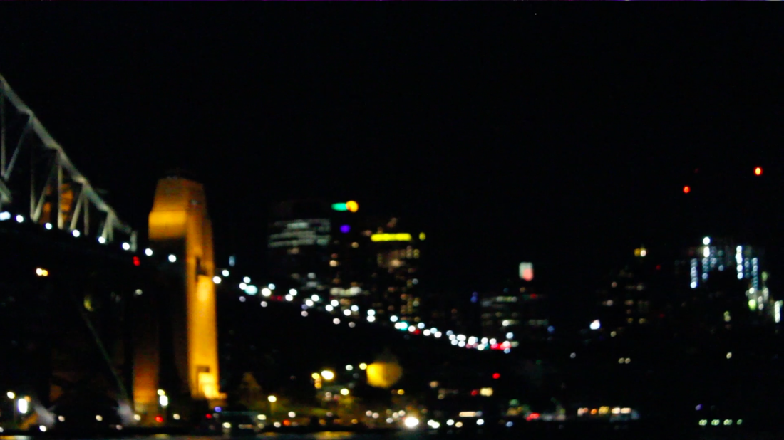
So i put that arrangement on the left side of the photo and then arranged the bubbles differently on the other side so it looked like this which i was happy with :
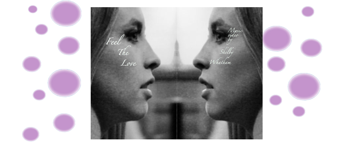
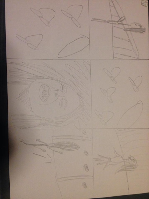
Then after watching some youtube videos previously on scrolling effects, I decided to add some effects to the bubbles and the picture in the middle itself. By adding motion and opacity and then adjusting where the bubbles would start at 0% opacity, to 50%, to then 100%, it created the effect of the bubbles floating into place as well as the picture which worked quite nicely.
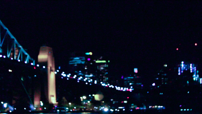
Because I liked this effect so much I decided to put more bubbles on the side of the video at the bottom of the home page and added the motion and opacity effect to it too like so :
Because I liked this effect so much I decided to put more bubbles on the side of the video at the bottom of the home page and added the motion and opacity effect to it too like so :
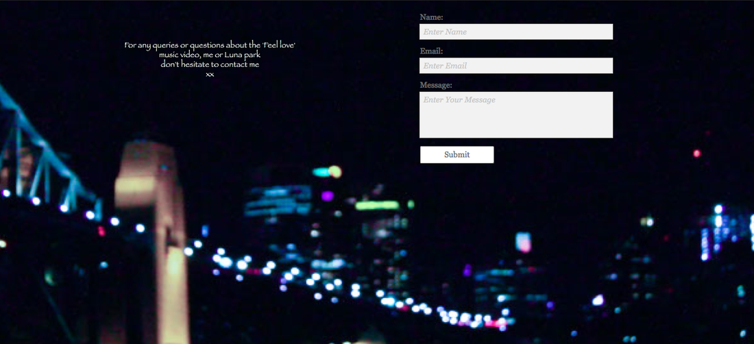
After that I was happy with how my Home page was looking so I decided to do my Contact page which I thought would be the simplest.
After having just one image as the background which is a simple backdrop of the harbour bridge and city lights as so to not drag the eye away from the actual contact form and information necessary, I needed to adjust the colouring of this image as well so it went with the purple/blue theme of the website
After having just one image as the background which is a simple backdrop of the harbour bridge and city lights as so to not drag the eye away from the actual contact form and information necessary, I needed to adjust the colouring of this image as well so it went with the purple/blue theme of the website
 |  |
putting the edited image as the backdrop, I added the simple contact form to the right side of the page remembering the rule of thirds from the filming project and then a simple yet effective little area of text to the left and that was it, I was happy with the contact page because I didn't need anything else on it :


 RSS Feed
