
https://helpx.adobe.com/muse/using/scroll-effects-opacity-slideshow-animate.html
http://www.scrolleffects.com/opacity.html
http://www.scrolleffects.com/light.html
https://www.youtube.com/watch?v=KJMi5l9Ru-g
http://99designs.com/designer-blog/2015/01/16/top-web-design-trends-2015/
https://www.youtube.com/watch?v=0KeeHpQioi8
http://www.quoplus.com
Today in class : Creating a master page
Today I started out on my website from scratch and decided to make a master page to get the basis for my other pages.
Firstly putting in all the individual pages which included
Home, About, Contact, Gallery, Behind the Scenes and Shop
After creating these blank pages i went onto the AMaster web page and started to think of what kind of top bar I would want and what font to base my Websites text on.
In the Widgets Library I went down to Menu's and chose a horizontal menu and placed it down, resized it and set it in place with the according pages ( eg. home, about contact..) Searching through all the fonts my top picks that I was trying to decide out of were Courier New, Lithos Pro and Papyrus.
I ended up going with Papyrus because I liked how it looked with the almost rough texture on the outsides of the lettering
Searching then for a logo to place, I saw that matt had just copied someone else's logo from google images so trying to stick with the theme of the video of a theme park i searched up ferris wheel logo's and found my two favourites to choose from :
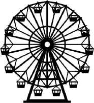 | 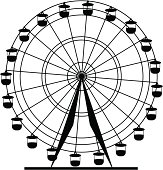 |
I chose to go with the second ferris wheel logo, but changed it slightly by removing two of the inner rings in the circle so that I wasnt COMPLETELY stealing someone else's logo for my website.
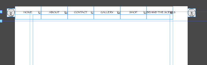
I firstly tried placing it on the left side of the menu bar because I see that in a lot of websites, however it just made the other side of the menu bar looking very blank and empty so instead of just having one I decided on putting one on either side of the menu bar as shown :
I firstly tried placing it on the left side of the menu bar because I see that in a lot of websites, however it just made the other side of the menu bar looking very blank and empty so instead of just having one I decided on putting one on either side of the menu bar as shown :
Applying this design to all of my pages I moved on to my home page because I already knew the basic design I wanted.
As seen on the Disneyland website, I wanted to have a big full screen slideshow of images of my video where you could then scroll down to the relevant information.
When going through my film and taking various screenshots I noticed that they all had a different colour scheme about them and a key factor to a website is a clear colour scheme which matches and lines up. So after taking the screenshots i took them and edited the images in photoshop so that they all matched in a sense
That was all I had time to do this lesson
 RSS Feed
